

Where Are You Actually Losing People?
Start with one number. Divide your orders by your sessions and multiply by 100. That's your conversion rate. For context, Littledata's benchmark of Shopify stores puts the average at roughly 1.4%, with the top 20% above 3.2% and the top 10% above 4.7% (benchmark summary by Blend Commerce). So 14 orders from 1,000 visitors is normal. Two orders from 1,000 means something specific is wrong.
Next, work out where people drop off. This table points you to the fix most likely to help.
Where visitors drop off | What it usually means | Start with |
Leave within a few seconds | Slow pages, the wrong audience, a confusing first screen | Fix 1 and Fix 6 |
View products but don't add to cart | Thin product pages, low trust, doubts about price | Fix 2, Fix 3 and Fix 4 |
Search or browse but find nothing | Weak navigation and on-site search | Fix 8 |
Add to cart but never start checkout | Surprise costs, unclear shipping or returns | Fix 4 and Fix 7 |
Start checkout but never pay | Too many steps, missing payment options | Fix 5 and Fix 7 |
You can't tell where they leave | Missing or broken tracking | Fix 10 |
The 10 Fixes, in the Order We'd Tackle Them
1. Fix Your Page Speed and Mobile Experience
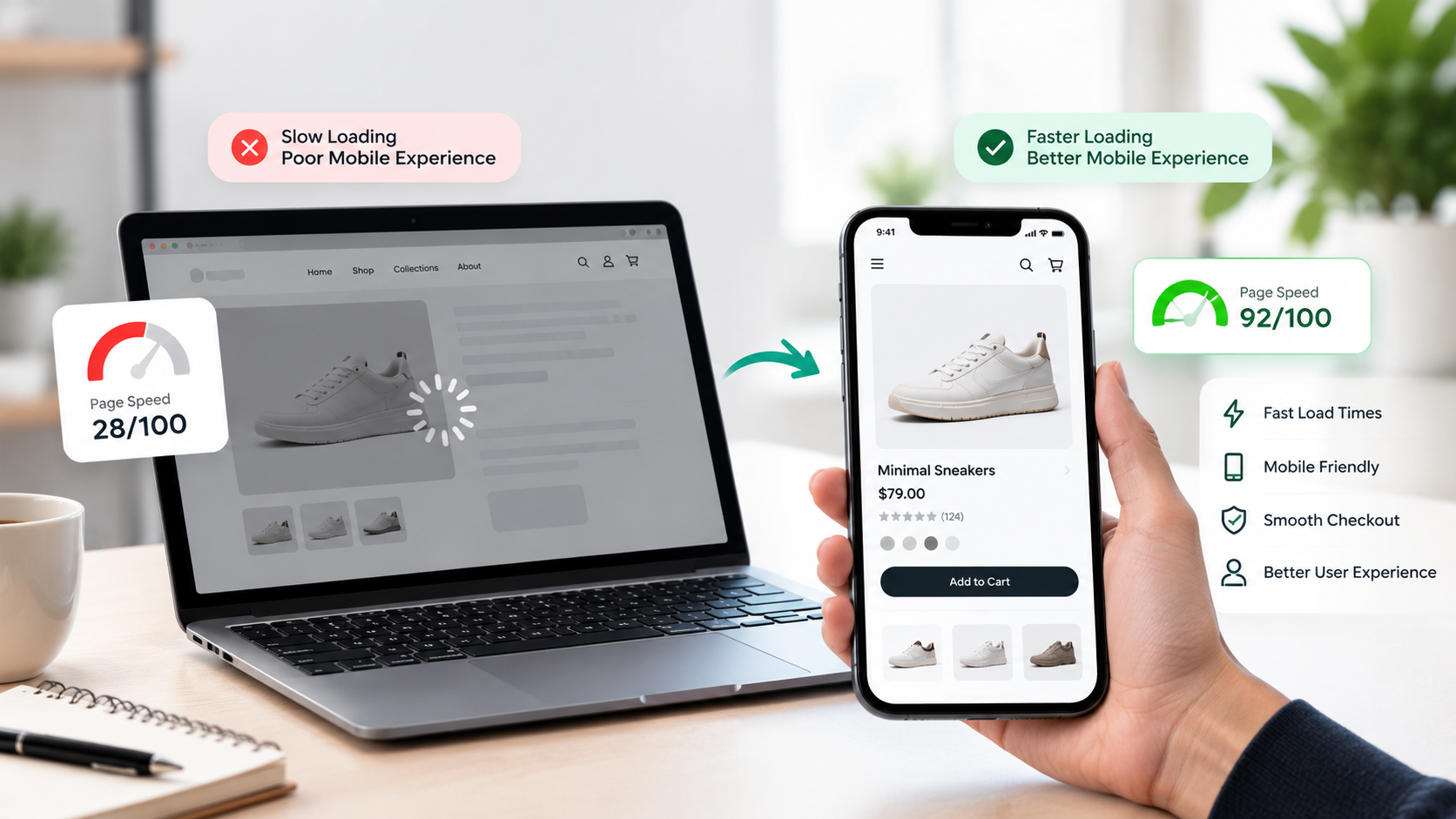
Pull out your phone, switch off Wi-Fi, and open your own store. Time how long it takes before you can actually see a product and tap Add to Cart. If you caught yourself waiting, so do your customers, and most of them won't wait as long as you just did.
Google's mobile speed research is a few years old now, but it found that the chance of a visitor bouncing goes up by 123% as load time stretches from one second to ten (Google). Slow stores lose people before the first image even appears.
On Shopify, the usual suspects are:
• Hero banners and product photos uploaded straight from a camera, sometimes 4 MB or more
• Apps that each add their own script, including ones you uninstalled months ago that left code behind in the theme
• Auto-playing sliders, pop-ups and chat widgets all loading at once
Run your homepage, a collection page and your best-selling product page through Google Page Speed Insights. Compress the images, remove the apps you don't use, and check that the Add to Cart button is easy to hit with a thumb. Small jobs, but on mobile they add up fast.
2. Rewrite Your Product Pages So They Actually Sell
A product page has one job: answer every question a shopper would ask a salesperson standing next to them. Most pages answer about two.
Look at yours with fresh eyes. Is the description the supplier's copy, pasted in as is? Is there one small photo? Is the size guide hidden, or missing? Shoppers can't pick the product up, so your page has to do that for them.
What usually helps:
• Several real photos from different angles, plus one of the product in use. A short video helps too
• Who it's for, what it's made of, how it fits or works, and what's in the box
• Benefits first, specs second. "Keeps your coffee hot for 12 hours" lands better than "double-wall vacuum insulation"
• Price, delivery estimate and the Add to Cart button all visible without scrolling on a phone
And write it honestly. Overselling leads to returns, and a return costs you more than the sale you were trying to win.
3. Build Trust Before You Ask for Money
A first-time visitor knows nothing about you. Quietly, in the first few seconds, they're deciding whether you're a real business that will actually ship the thing.
Check how your store looks through those eyes:
• Reviews. A store with no reviews feels abandoned. Ask for them after delivery, with photos if you can. Never fake them, because shoppers can usually tell
• A real About page, with a real story and a real location
• Contact details someone can use, like an email, a phone number or WhatsApp, and an address if you have one
• Return and refund policies in plain language, linked from the product page
• Recognizable payment icons near the Add to Cart button
Then check the unglamorous stuff. Broken links, typos, mismatched fonts, a footer full of dead pages. None of it looks like much alone, but together it says nobody is minding this shop. If the whole design feels dated or cluttered, a proper UI/UX refresh can fix most of it in one go.
4. Be Upfront About Price, Shipping and Returns
Few things kill a sale faster than a surprise at the last step. The shopper sees $39, adds it to the cart, and at checkout it's $39 plus $9 shipping plus tax. A lot of them just close the tab.
So don't hide the extra costs. Put delivery time and cost on the product page. If you offer free shipping above a certain amount, add a progress bar in the cart ("You're $12 away from free shipping"), which tends to nudge order value up as well. Show an estimated delivery date instead of a vague "3 to 7 business days."
Do the same with returns. One plain sentence near the buy button, like "Free returns within 30 days," does more than a policy page nobody opens. If you sell in several countries, show prices in local currency so people don't have to do the math.
Finally, ask whether your price makes sense for what the page shows. Being more expensive than a competitor is fine, as long as the page says why: better materials, faster support, a real guarantee. Silence reads as "overpriced."
5. Cut the Friction Out of Checkout
Baymard Institute, which has tested ecommerce checkouts for years, estimates that the average large ecommerce site could lift conversions by about 35% just by fixing checkout usability problems (Baymard). That's a big number for something that doesn't need any new traffic.
Shopify's checkout is already well built, so most of the wins come from what you control around it:
• Turn on accelerated options like Shop Pay, Apple Pay and Google Pay, so returning buyers can pay in a couple of taps
• Offer the payment methods your customers actually use, whether that's cards, UPI, wallets, buy now pay later or cash on delivery, depending on your market
• Let people check out as guests. Forcing account creation before payment loses people
• Keep the form short and don't ask for anything you don't need
• Make sure no app or script is interfering with the page
Then do the most useful test there is: place a real order on your own phone, start to finish, and note every moment you hesitated. Those moments are your fix list. And if you've outgrown the standard options, Shopify Plus gives you more control over the checkout experience.
6. Check the Quality of Your Traffic, Not Just the Amount
Here's an uncomfortable thought. Maybe your store is fine and the wrong people are visiting it.
A viral Reel can send 20,000 visitors who were never going to buy a $60 candle. Broad ad targeting can send people from countries you don't even ship to. An ad can promise "50% off" and land on a page where nothing is on sale. Every one of those visits counts as traffic, and none of them counts as revenue.
Open your analytics and break conversion rate down by traffic source, device, country and landing page. You'll usually find one or two channels doing all the work and a few dragging the average down. Then:
• Pause or rework the worst-performing sources
• Send ad traffic to the exact product or collection it talks about, not the homepage
• Make the ad headline and the landing page say the same thing
• Exclude locations you can't ship to
500 visitors who actually want your product are worth more than 5,000 who don't. If paid campaigns are where the mismatch sits, that's squarely what performance marketing is meant to sort out.
7. Follow Up With People Who Left Without Buying
Across the 50 studies Baymard Institute has collected, about 70% of shopping carts get abandoned (Baymard). Plenty of those people were just browsing and never planned to buy, so you won't win them all back. But some of them wanted it and got distracted, or had one small doubt, and a good follow-up can settle it.
Shopify has an abandoned checkout email built in, and a surprising number of stores either leave it switched off or never touch the default wording. Set it up properly:
1. Within an hour: a friendly reminder with the product image and a direct link back to the cart
2. After about a day: answer the likely objections, with a few reviews, your return policy and a delivery estimate
3. After two or three days: a last nudge, and a small incentive only if your margins can handle it
Where your customers are comfortable with it, add SMS or WhatsApp. And collect the email address early, so you have someone to follow up with in the first place. A well-built email and lifecycle program turns a one-off visitor into a repeat customer, which is where the real money is.
8. Make Products Easy to Find
If someone has to hunt for what they came for, they'll leave and try a competitor. Wandering around your store isn't something shoppers do for fun.
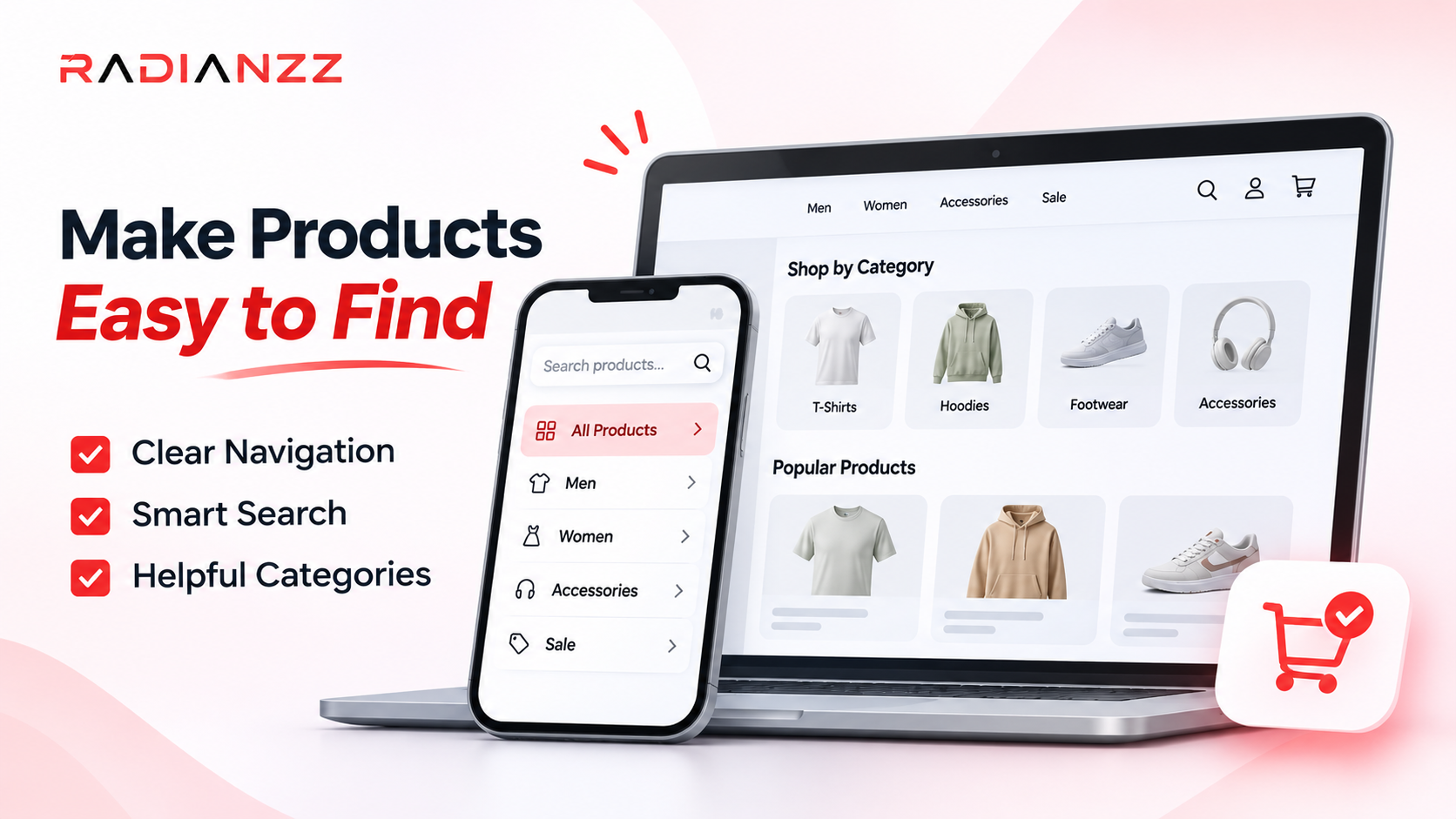
Start with the menu. Use the words customers use, not internal names. "Running Shoes" beats "Performance Footwear Collection." Keep the top level short, and make sure your best sellers are within one or two clicks of the homepage.
Then look at on-site search. Check what people type into it, especially the searches that return nothing. That list is free market research: it tells you what people expect you to sell and can't find. Shopify's Search & Discovery app helps with this, including synonyms and filters.
And finally, collection pages. Add filters that make sense for your products (size, color, price, material), sort best sellers to the top, and write a short intro that helps people choose. A grid of 60 identical-looking tiles isn't a shopping experience.
9. Show Up Where Buyers Are Now: Answer Engines and AI Search
People don't only type keywords into Google anymore. They ask full questions, like "which running shoes are best for flat feet?" in Google, ChatGPT, Gemini or Perplexity, and they expect an answer, not ten links.
This matters for a traffic-but-no-sales problem, because of who it brings you. A visitor who found you by asking a specific question is usually closer to buying than someone who clicked a broad blog post. If your traffic is mostly curious readers, tightening up this side can change the mix.
The practical steps:
• Put real answers on your pages: FAQs on product pages, "which one should I pick?" guides, honest comparisons
• Keep product details complete and consistent everywhere (title, specs, price, availability)
• Add structured data such as Product, Offer and Review markup, and make sure it matches what's visible on the page
• Keep your brand information the same across your site and your business profiles
Nobody can guarantee a spot in an AI answer, and we'd be wary of anyone who does. But clear, structured, trustworthy pages give you a better shot. We cover this in detail in our guide to optimizing a Shopify store for AEO and GEO.
10. Track Properly and Test One Thing at a Time
You can't fix what you can't see. Plenty of stores run for months with broken tracking, then make decisions off numbers that were never right.
Start by checking that your key events actually fire: product views, add to cart, checkout started and purchase. Look for duplicate purchase events, or a cookie banner that quietly blocks everything. Then watch how people really behave. A free tool like Microsoft Clarity gives you heatmaps and session recordings, and sitting through even 20 mobile recordings will show you things no dashboard does: rage taps, people hunting for the size chart, a button that sits under the keyboard.
Once you know where the problems are, change one thing at a time. If you rewrite the product page, swap the photos and change the price in the same week, you'll never know which of them moved the needle. Give each change enough time and enough orders to mean something, because a weekend of data isn't a result. Keep a simple log with the change, the date and what happened. In six months, that log will be one of the most useful things you have.
How Radianzz Can Help Turn Your Traffic Into Sales
You may have noticed that these ten fixes overlap. Speed affects design, design affects trust, traffic quality affects tracking, and tracking affects every decision after that. Fix one in isolation and the gain often gets swallowed by another leak somewhere else.
That's why we like to look at the whole store at once. At Radianzz, the same team works across Shopify development, UI/UX design, performance marketing, SEO and lifecycle marketing, so we can find where your store is leaking and fix things in an order that makes sense.
Where you're stuck | How Radianzz helps | Fixes covered |
Slow store, messy theme, app overload, broken tracking | Shopify and Shopify Plus development and optimization, including checkout customization on Plus | 1, 5, 10 |
Product pages that don't convince, a design that feels untrustworthy | UI/UX and product design built around how your customers actually shop | 2, 3, 4, 8 |
Lots of visitors, wrong audience | Performance marketing that focuses on buyers, not clicks | 6 |
Carts left behind, one-time buyers | Lifecycle and email marketing for cart recovery and repeat purchases | 7 |
Not showing up in Google or AI answers | SEO and content strategy, including AEO and GEO | 9 |
Nobody left to keep testing and fixing | Maintenance and support so the improvements don't stop after launch | 10 |
How We Usually Start
We begin with an audit, not a pitch. That means going through your analytics, your mobile experience, page speed, product pages and checkout, and then pulling it into a short, prioritized list of what's costing you the most sales. After that, we fix the biggest leaks first, measure what changed, and keep testing from there.
If you'd like to see the kind of work we do, take a look at our case studies and our full list of services.
Ready to Find Out Where Your Store Is Leaking?
Tell us about your store, your traffic and where sales seem to stop. We'll connect you with a senior practitioner who'll take a proper look. Start a conversation with Radianzz or write to us at info@radianzz.com.
Conclusion
A store with traffic and no sales feels like a mystery, but it rarely is one. Somewhere between the first click and the final payment, people are running into slow pages, thin product details, trust gaps, surprise costs, a clumsy checkout, the wrong audience, or silence after they leave. The ten fixes above cover those spots.
Don't try to do all ten at once. Use the table near the top to see where your visitors actually drop off, fix the two or three that match, measure the result, then move on to the next. Small gains matter more than they look. Going from a 1% conversion rate to 2% on the same traffic doubles your sales, and it costs you nothing extra in ad spend.
Traffic is expensive to earn. Make sure your store deserves it.