

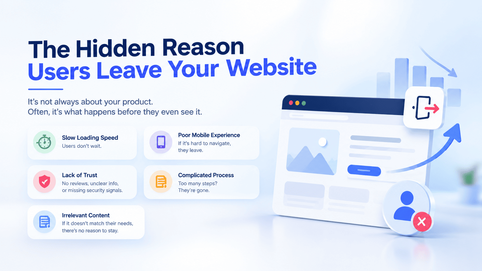
Most businesses assume visitors leave because they are not interested.
Often, that isn't the real problem.
A visitor may arrive with genuine intent, find the right product or service, and still leave because the website creates friction confusion, uncertainty, slow performance, complicated navigation, weak trust signals, or unnecessary steps.
This is where Conversion Rate Optimization (CRO) becomes critical.
CRO isn't simply about changing button colors or running A/B tests. It is about understanding why users hesitate, abandon, and leave, then systematically removing the barriers that prevent them from converting.
For ecommerce businesses, this can have a significant impact. Instead of continually spending more on SEO, paid advertising, social media, and other acquisition channels, businesses can improve the value generated from the traffic they already have.
What Is Conversion Friction?
Conversion friction is anything that makes it unnecessarily difficult for a visitor to complete a desired action.
That action could be:
Purchasing a product
Requesting a quote
Booking a consultation
Submitting a form
Starting a subscription
Creating an account
Contacting sales
Some friction is obvious, such as a broken checkout button.
Other friction is hidden:
Visitors cannot quickly understand the value proposition.
Product information is incomplete.
Navigation doesn't match customer expectations.
Pages load slowly.
Shipping costs appear unexpectedly.
Checkout requires too much information.
Customers don't see enough trust signals.
Mobile interactions are difficult.
These problems may not be obvious from traffic reports alone. They become visible when businesses analyze user behavior and the customer journey.
Why Users Leave Websites
1. They Don't Understand the Value Quickly
A visitor should not have to spend several minutes figuring out what your business offers.
When someone lands on a page, they are usually asking:
What is this?
Is it relevant to me?
Why should I choose it?
What should I do next?
If the answers aren't clear, users may leave even when your offering is exactly what they need.
Your headline, supporting copy, imagery, and primary CTA should work together to establish relevance quickly.
2. The Website Is Too Slow
Performance is not simply a technical SEO consideration.
It directly affects the customer experience.
Users expect websites to respond quickly, particularly on mobile devices. Slow pages, delayed interactions, and unstable layouts create frustration and reduce the likelihood that visitors will continue their journey.
For ecommerce businesses, performance matters across the entire funnel:
Landing Page → Search → Product Page → Cart → Checkout → Payment
Optimizing only the homepage isn't enough.
Businesses should identify which performance problems affect their highest-value customer journeys and prioritize those first.
3. Navigation Makes Users Work Too Hard
Your internal team may understand your website architecture.
Your customers don't have to.
If visitors cannot quickly determine where to find products, services, pricing, resources, or support, they may abandon the experience.
Effective navigation should make it easy to:
Understand where you are
Find relevant products or services
Search for specific information
Filter and compare options
Move between related pages
Return to previous sections
For ecommerce, strong navigation should work alongside site search, filtering, sorting, and product categorization.
The objective is simple:
Help customers find what they want with as little cognitive effort as possible.
4. Product Pages Create Uncertainty
Getting a customer onto a product page is only half the battle.
The product page must provide enough information to support a purchase decision.
Customers may want to know:
What does the product do?
Is it right for me?
What are the specifications?
Is it available?
When will it arrive?
Can I return it?
What do other customers think?
Are there additional costs?
Effective product pages should combine:
Clear product descriptions
High-quality imagery
Specifications
Pricing
Availability
Delivery information
Reviews and ratings
Return information
FAQs
Relevant recommendations
Clear calls-to-action
The objective isn't simply to create longer product descriptions.
It is to remove purchase uncertainty.
5. Customers Don't Trust the Website Enough
A customer can want a product and still decide not to purchase it.
Trust becomes particularly important when:
The brand is unfamiliar.
The product is expensive.
Customers must provide personal information.
Payment information is required.
The purchase is recurring.
Returns or warranties matter.
Trust signals can include:
Customer reviews
Ratings
Testimonials
Clear return policies
Shipping information
Contact information
Warranty details
Secure payment options
Customer support availability
Trust should appear where customers make decisions, not only in the website footer.
6. Mobile Users Experience Too Much Friction
A website can look excellent on desktop while delivering a poor mobile experience.
Mobile users interact with:
Smaller screens
Touch controls
Virtual keyboards
Mobile networks
Limited screen space
Responsive design alone isn't enough.
Test the complete mobile customer journey:
Discovery → Search → Product → Cart → Checkout → Payment
Check whether users can easily:
Open navigation
Search products
Apply filters
Select variants
Read product information
Find CTAs
Enter information
Complete payment
Mobile CRO should focus on ease of completion, not simply whether the website technically fits the screen.
7. Checkout Requires Too Much Effort
Checkout is one of the most valuable stages of the customer journey because purchase intent is already high.
That also makes unnecessary friction particularly expensive.
Review every checkout field and interaction and ask:
Does the customer really need to provide this information?
Reduce:
Unnecessary fields
Forced account creation
Repetitive information
Confusing validation
Unexpected fees
Complicated payment selection
Unclear delivery information
The goal isn't necessarily to create a one-page checkout.
The goal is to create a simple, predictable, trustworthy checkout experience.
8. Unexpected Costs Cause Abandonment
Imagine a customer sees a product priced at $100.
At checkout, they suddenly discover:
$18 shipping
$7 service fee
Additional taxes
The customer may not have changed their mind about the product.
They may have changed their mind about the purchase experience.
Where possible, communicate:
Shipping costs
Taxes
Delivery expectations
Subscription terms
Additional fees
Minimum order requirements
Transparency reduces surprises and helps customers make informed decisions.
9. Your CTA Doesn't Explain the Next Step
Generic CTAs such as "Submit" or "Continue" provide little context.
More specific CTAs can communicate the action and expected outcome:
Get My Free Consultation
Start My Ecommerce Assessment
Continue to Secure Checkout
Request a Product Demo
The CTA should also match the visitor's intent.
Someone reading an educational article may not be ready to Buy Now.
They may be more receptive to:
Explore the Solution or Talk to an Ecommerce Specialist.
10. Every Visitor Gets the Same Experience
Not every visitor has the same intent.
A first-time visitor is different from a returning customer.
Someone arriving from Google is different from an existing customer.
A visitor searching for a specific product is different from someone browsing categories.
Relevant personalization can include:
Recently viewed products
Product recommendations
Personalized merchandising
Returning-customer experiences
Location-aware content
Relevant offers
Behavioral recommendations
The objective isn't personalization for its own sake.
It is making the experience more relevant to the visitor.
How to Discover Why Users Leave Your Website
Analyze the Conversion Funnel
Break the customer journey into stages:
Landing Page → Product Discovery → Product Page → Cart → Checkout → Purchase
Look for significant drop-offs across:
Devices
Traffic sources
Landing pages
Product categories
Customer segments
Analytics tells you where the problem is.
Additional behavioral research can help explain why it happens.
Use Heatmaps and Session Recordings
Heatmaps can reveal:
Where users click
What they ignore
How far they scroll
Which elements receive attention
Whether users click non-interactive elements
Session recordings can expose users:
Struggling with filters
Repeatedly clicking buttons
Searching for missing information
Opening and closing navigation
Getting stuck inside forms
These insights can reveal friction that standard analytics cannot.
Ask Your Customers
Sometimes the simplest approach is the most valuable.
Ask:
"What prevented you from completing your purchase?"
"What information were you looking for?"
"Was anything confusing?"
"What almost stopped you from purchasing?"
Customer feedback can uncover problems that analytics alone cannot explain.
Build a Data-Driven CRO Process
Effective CRO should follow a continuous cycle:
Analyze → Identify → Prioritize → Test → Measure → Learn → Optimize
Don't redesign the entire website based on assumptions.
Instead, create a hypothesis.
For example:
Hypothesis: Customers abandon product pages because shipping information is difficult to find.
Test:
Move shipping information closer to pricing and the primary CTA.
Then measure changes in:
Product engagement
Add-to-cart rate
Checkout initiation
Conversion rate
This approach turns CRO into a measurable business process.
CRO Metrics That Matter
Monitor metrics across the entire customer journey.
Acquisition Metrics
Organic traffic
Paid traffic
Referral traffic
Landing-page sessions
Engagement Metrics
Engagement rate
Site search usage
Product discovery
Scroll depth
Conversion Metrics
Conversion rate
Add-to-cart rate
Checkout-start rate
Checkout completion rate
Form completion rate
Revenue Metrics
Average Order Value
Revenue per visitor
Revenue per session
Customer Lifetime Value
Retention Metrics
Repeat purchase rate
Customer retention
Subscription retention
Importantly, compare these metrics by device, traffic source, customer segment, and funnel stage rather than relying only on site-wide averages.
How Radianzz Helps Improve Ecommerce Conversions
At Radianzz, we approach CRO as a combination of strategy, UX, technology, performance, analytics, and continuous experimentation.
Our goal isn't simply to make websites look better.
It is to make digital commerce experiences easier, faster, clearer, and more effective.
Ecommerce CRO Strategy
We identify conversion barriers across:
Landing pages
Navigation
Search
Product discovery
Product pages
Cart
Checkout
Mobile experiences
UX Optimization
We design customer journeys that help visitors:
Find products
Understand value
Compare options
Build confidence
Take action
Complete purchases
Ecommerce Performance Optimization
We evaluate:
Page speed
JavaScript execution
Image delivery
Mobile performance
Core Web Vitals
Third-party scripts
Analytics & Behavioral Optimization
We use:
Funnel analysis
Heatmaps
Session recordings
Customer feedback
Conversion analysis
A/B testing
This creates a continuous improvement process based on evidence rather than assumptions.
Conclusion
When ecommerce revenue isn't growing as expected, businesses often assume they need more traffic.
Sometimes they do.
But before increasing acquisition spend, ask a more important question:
What Happens After Visitors Arrive?
If users cannot understand your value proposition, find products, trust your business, navigate comfortably, or complete checkout without unnecessary effort, more traffic may simply create more opportunities for abandonment.
The hidden reason users leave isn't always lack of interest.
Sometimes, the experience gives them too many reasons to stop.
CRO helps uncover those reasons.
By identifying friction, analyzing behavior, testing improvements, and continuously optimizing the customer journey, businesses can generate more value from the traffic they already have.